Share
Author
George Anderson
Share
New B2B Cart for eCommerce
A lot has changed since Corevist was founded as B2B2dot0 in 2008. Mobile device usage has soared, and Millennials have taken a larger and larger role in the workforce. As major eCommerce sites like Amazon have upped the ante in user experience, B2B buyers have come to expect the same kind of user experience in SAP B2B eCommerce.
That’s why we’re delighted to unveil the new Corevist Cart. It still talks to SAP in real time, but now it’s easier to use than ever—especially for new users. For SAP manufacturers, that means higher adoption rates and greater eCommerce throughput.
The new cart also takes more data from SAP to help the customer prepare SAP-ready orders. That’s a huge friction reliever for our clients and their customers.
So what does the new cart do? What does it look like? Let’s dive in.
The new cart conforms to current best practices in eCommerce layout
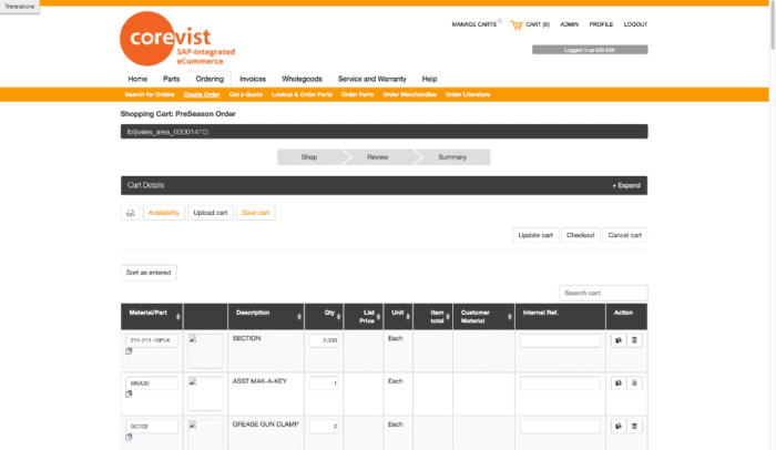
The old Corevist cart.
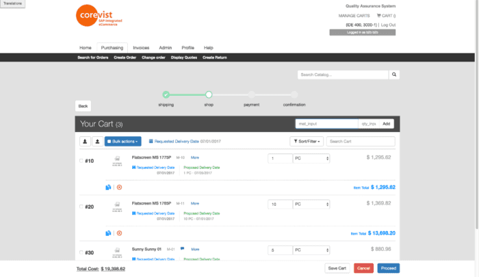
The new Corevist cart.
Our goal is to reduce customer friction for our clients and, therefore, increase order throughput. There is a constant balance to be found here, from a design perspective. We have to handle the complexity of B2B while creating an intuitive user experience (UX).
Visually, our new cart layout guides the user through the buying process. That means a simpler B2B procurement journey, all the way from point A to point Z.
Simplified header keeps crucial information above the fold
Since the old cart was designed in the glory-days of desktop, it accommodated a lot of information in the header. However, two increasing factors led us to reevaluate our header layout: the rise of mobile, and frequent client requests to reduce the number of items in the header.
From the perspective of graphic design, the header took up a large amount of real estate at the top of the page. That would push the cart almost below the fold on some monitors. We wanted to raise the cart and details higher on the page.
But how could we consolidate the header without losing data inputs that are crucial for B2B eCommerce? Unlike B2C, B2B often requires the user to input things like shipping address and shipping method before the user adds items to the cart. Pricing and availability are often tied to shipping address and shipping method. In B2B, we need to get that info earlier in the process so we can run simulations on what’s in the cart. That allows us to display accurate pricing information, what can or can’t be shipped from warehouse A, B, or C, and so on.
In the old cart, all of that was built into 1 step in the cart. It sat in a header information block. You had to input all your settings properly if you wanted to continue to payment. We wanted to take that out so customers weren’t presented with a huge form and the cart in the same step. Of course, all of that information is still crucial, and customers still have to put it in.
So if the new cart doesn’t handle that crucial information at the top of the page, where does it handle it? Keep reading…
Wizard features help customers craft SAP-ready orders
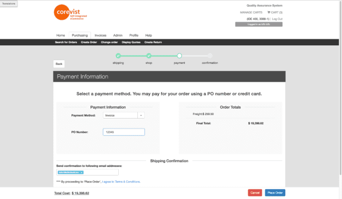
Wizard-style progression clearly displays purchase progress.
It’s a classic problem in SAP-integrated eCommerce. How do you bridge the gap between the eCommerce buyer’s knowledge and what’s possible in SAP? This problem covers many areas, including contract pricing, credit limits, and accuracy of SKU numbers.
This is one point where the Corevist cart absolutely beats the competition. Because of our real-time architecture, we guarantee that all orders placed on our website are 100% error-free as far as SAP is concerned. That means that if an order is placed on the web site, the customer can be 100% certain that they won’t get a phone call telling them that they’ve tried to ship to a shipto that isn’t on file, that they tried ordering a sku that is no longer available or allowed to be sold to them, or that they didn’t order the minimum quantity required. All those error messages are delivered in real time and require the customer to acknowledge or fix. Other solutions which don’t have that real time integration with SAP may not learn of the problem for 24 hours… or more. In the world of B2B selling, that’s a long time.
Here’s an example.
Say the customer selects 2nd-day air as the shipping type in step 1. In step 2, they add a line item to the cart that can’t be air-shipped. This scenario deviates from the standard point A to point B cart experience, and it needs to be handled in a way that reduces friction and ensures that the order still gets placed.
Our solution is to show an error message–in real time, not 24 hours later. We alert the customer that a selected item can’t be shipped by 2nd day air. But we don’t stop there. We also tell them how to fix it. In this case, we alert them that they can remove that item from their cart, or they can go back and select a different shipping method. Then we let the customer continue with the flow of the cart.
That’s our goal with UX: to simplify and make it easy to work through the process without a lot of “gotchas”. The ultimate goal is a happy customer and an order that can post to SAP without any errors. The new cart makes it nearly impossible to place an invalid order in SAP.
More intuitive (and extensible) display of product information
The old Corevist cart used a table-based graphic layout that moved left to right before moving down a line. But clients began to request more and more information displayed on a per-product basis. They wanted to see things like unit price, extended price, inventory batch numbers, sourcing plant information, and much more. We quickly ran out of room to display this data horizontally. That meant we had to use a “show more” button (signified by a + sign) to alert users that they had to make an extra click to see all the product information.
Not only did this add an extra step to the process of getting product information in the cart, it also complicated the experience on tablet and mobile.
Now product information is displayed vertically. We can add as many product descriptors as a client wants to this vertical display. The resulting layout scales perfectly on mobile and tablet, and it gives us full flexibility to display as much or as little product information as the client wants—without the need for a “show more” button.
Fewer lines of code = faster cart, better support
Since we were essentially redesigning the cart from the ground up, we had the opportunity to consolidate years of additions to the original base code into a lightweight, integrated, streamlined package.
Our clients’ customers experience this lightweight cart as an increase in speed. But that’s not the only benefit. The lean, efficient code makes it much easier for our team to support the cart for our clients. In the back office, we love the new cart. We can resolve support issues quickly, which means better service for our clients. Because the code base is so lean and elegant, it will also make us more nimble and efficient, so we can add new features to the cart in the future. That’s a huge win.
Quick entry functionality for power users
We’ve always had CSV upload/download in the cart as an order entry and export method. But we didn’t have an input field for quick entry. Now we do. You can type SKU numbers in their fields and navigate the quick entry functionality with the TAB and ENTER keys.
This allows power users to pound orders into the cart—fast. You just type the SKU, hit tab, hit quantity, and hit enter. The tool inputs the line item, then immediately resets so you can enter the next line item. If you know all the SKU numbers and quantities that you need to order, you can manually dump them into the cart very fast.
Not only do our clients’ power users love this feature, but our team does, too. We find it very handy when we need to enter test data in the development and QA process.
Search filtering through the cart
Another functionality piece which we’ve added is search filtering through the cart. If a client uploads a 100-line CSV, they don’t want to scroll through all of that data. It’s just too much.
We’ve added a search field to handle this. As you type ahead, this functionality filters the cart down to just your matching search terms. You can immediately condense the amount of items you’re seeing in the cart and combine that with sorting and filtering. Whatever you search, you can then sort the search results by a secondary field like item cost, ordered ascending or descending. You can filter by items that are pending, available, or not available. You now have a strong manipulation factor in the cart for viewing filtered portions of it.
Bulk item modification
We’ve also added bulk features so you can select (or deselect) all items in the cart by clicking a single checkmark. Once the items are selected, you can copy, delete, and so on. While this functionality may not be necessary in every use case, it’s available now for off-the-wall cases when it comes in handy. It brings a new polish to the cart.
The Takeaway
We couldn’t be happier with the new Corevist Cart. In the process of designing and building it, we added some functionality that never existed before. Rather than just solve the existing problems, we wanted to go above and beyond to anticipate our clients’ problems. What else could we add to make implementation, support, and user experience easier?
We believe we’ve achieved that—and much more. The old cart was great for 2008, and it had a long run. But the new cart is ready for 2017 and beyond. We hope you’ll find great use out of it, and let us know what you think of it.
Image courtesy of Caden Crawford. Licensed under Creative Commons 2.0-ND.